Connect Figma to Storybook
Embed stories in your Figma files

UI implementation and design naturally diverge over time which leads to confusion around the source of truth. Chromatic already brings collaborators across disciplines into the development workflow. Now, Chromatic also bridges the gap between code and design tools!
I’m excited to announce that we’ve partnered with Figma to create Storybook Connect, a plugin that links your stories to variants. It helps you compare implementation to design specs to speed up handoff and UI review.
- 🔗 Link stories to component variants
- 🕹 Play with live implementation in Figma
- 📌 Highlight components to reuse
- 📐 Compare story to spec
- 🔐 Setup private projects with access control
Why link stories to variants
Developers use Storybook to develop UI components and capture their states as stories. While designers model these states as component variants in Figma. It’s not uncommon to lose parity between these two tools during hand-off.
Our new Figma plugin, Storybook Connect, links stories directly to their corresponding variants. This helps teams resolve inconsistencies earlier in the design process and identify reusable components. Jump to the docs or read on for the features.
Set it and forget it
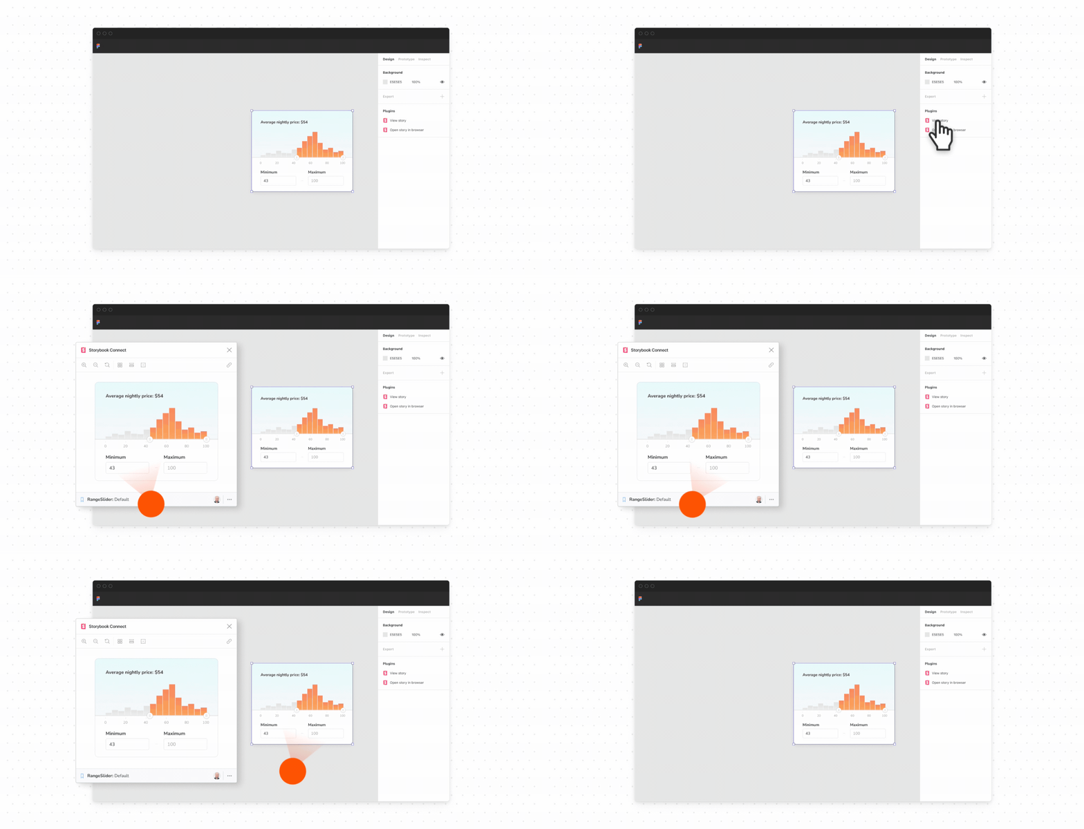
Link your stories once and we’ll keep them up to date with the latest versions of the design or implementation. Just click on the component in Figma then paste the story URL from Chromatic that matches the design and you’re done.
Open the live story next to the component design. Designers can check how a component works before using it in their designs.
Smoother handoff between design and development
The plugin streamlines handoff by surfacing which design components have already been implemented. Links to a Component’s stories are called out in the Figma sidebar.
During handoff, click “Open story in browser” to jump into the complete Storybook environment with addons, tests, and API docs.
Review implementation together
The plugin helps designers check that the rendered UI matches their designs via the same Storybook addons that your developers use.
Use the Measure addon to compare dimensions and spacing of DOM elements to design specs.
The Outline addon visualizes the boundaries of each DOM element for debugging CSS alignment.
Verify whether a component’s color palette is accessible by toggling the Accessibility addon’s visual filters to simulate different forms of colorblindness.
Try the plugin now
Learn how to unite your component code with the corresponding design specs. Go to our setup docs now!
What’s next?
Our goal is to unite component-driven tools like Storybook and Figma into one seamless workflow. That starts with establishing a persistent link between design and development components.
With the plugin, you can now view stories in Figma. We hope to make that component link omni-directional, allowing you to embed Figma back into Storybook (via an addon) or any other tool (via an API).
Have questions? Reach out to us through our in-app chat.